The simple design secret that instantly elevates your living room
Why Some Living Rooms Look Expensive (Even on a Budget)


7
Have you ever noticed how some living rooms feel effortlessly luxurious—while others, even with nice furniture, feel unfinished or chaotic?
The difference is rarely about price. It’s about color balance.
High-end interiors follow a structure that creates harmony and visual flow. Without that structure, even expensive pieces can look mismatched.
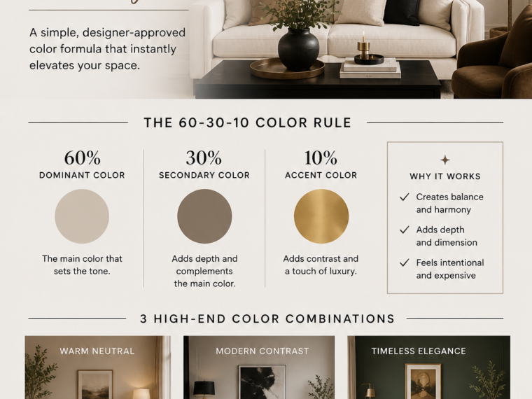
One of the most effective methods designers use is the 60–30–10 color formula. It’s simple, practical, and works in any space—large or small.
What Is the High-End Color Formula?


7
The formula is based on three proportions:
- 60% – Dominant color
- 30% – Secondary color
- 10% – Accent color
This balance creates a space that feels:
- Cohesive
- Intentional
- Visually pleasing
Instead of random colors competing, each one has a clear role.
Step 1: The 60% — Your Elegant Base


7
The dominant color covers most of your room. It sets the tone and creates that “expensive” feel.
You’ll usually find it in:
- Walls
- Sofas
- Large furniture
Best choices for a high-end look:
- Warm white
- Cream
- Beige
- Soft gray
- Taupe
Why these work:
- They reflect light beautifully
- They feel calm and refined
- They create a timeless base
A strong neutral foundation is the first step toward a luxurious space.
Step 2: The 30% — Depth and Sophistication


6
The secondary color supports your base and adds dimension.
It often appears in:
- Rugs
- Curtains
- Accent chairs
- Wood elements
High-end combinations include:
- Beige + warm brown
- White + soft gray
- Neutral base + muted green
The key is subtle contrast. This layer should enhance, not overpower.
Step 3: The 10% — The Luxury Touch


9
This is where your room gains personality and polish.
Accent colors are used sparingly:
- Cushions
- Decorative objects
- Artwork
- Lamps
Popular high-end accents:
- Black (for contrast)
- Gold or brass (for warmth)
- Deep green or navy (for richness)
Because it’s only 10%, this color stands out without overwhelming the space.
Real Examples You Can Copy
1. The Classic Luxury Neutral


9
- 60%: Cream / beige
- 30%: Warm brown / wood
- 10%: Black or gold
Result: Timeless, warm, and sophisticated.
2. The Modern High-End Look


7
- 60%: White
- 30%: Gray
- 10%: Black
Result: Clean, sharp, and ultra-modern.
3. The Earthy Luxe Style


8
- 60%: Warm beige
- 30%: Olive green
- 10%: Terracotta or brass
Result: Cozy, natural, and refined.
The Secret Designers Don’t Always Say


7
Color alone isn’t enough.
High-end spaces also rely on texture:
- Linen
- Wood
- Marble
- Wool
- Metal
Even if your colors are simple, mixing textures adds depth and richness.
A beige room with no texture feels flat.
A beige room with layered materials feels luxurious.
Mistakes That Ruin the High-End Look


8
Avoid these common issues:
Too many colors
→ Stick to a clear palette
No contrast
→ Add a darker or richer tone
Too many small items
→ Choose fewer, better pieces
Ignoring consistency
→ Keep undertones aligned (warm or cool)
How to Apply This Without Buying Everything Again


7
You don’t need a full makeover.
Start small:
- Change pillow covers
- Add a rug in your 30% color
- Introduce 1–2 accent pieces
Even small updates can rebalance your room and make it feel instantly more refined.
Final Thought
The difference between an average living room and a high-end one isn’t about spending more—it’s about choosing colors with intention.
The 60–30–10 formula gives you a clear structure:
- A calm base
- A supporting layer
- A bold finishing touch
Once you apply it, your space will feel more cohesive, elegant, and thoughtfully designed.
And that’s what truly makes a room look expensive.