The Perfect Living Room Color Formula

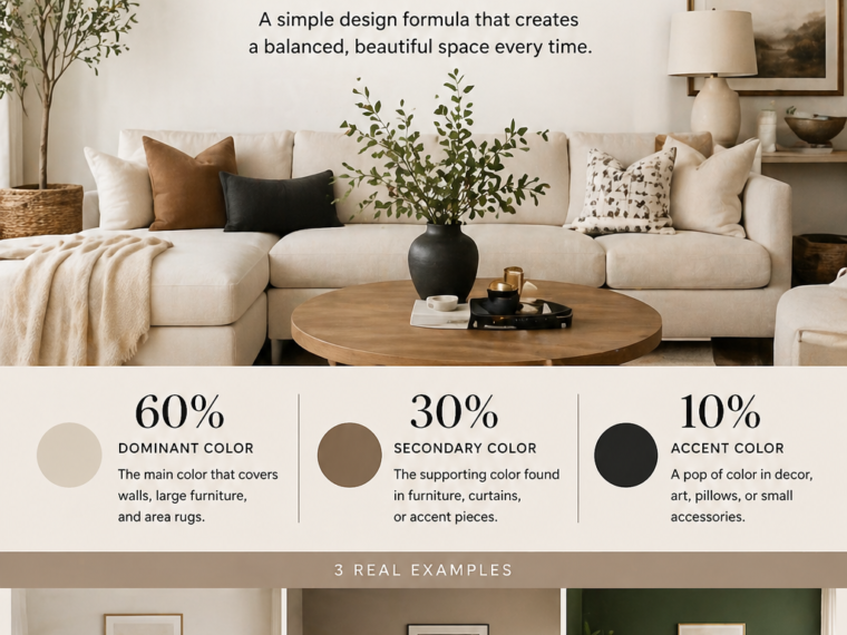
How to use the 60–30–10 rule to create a balanced, beautiful space


Why Color Feels So Difficult (But Doesn’t Have to Be)

https://images.openai.com/static-rsc-4/AhCfCEkQll-_HZVfUasDUUaKBcDL0j7AYSz5CCaBH1fx-crJc37ioxY3_T8Sq22hH--iNfUFm220GTREZRKn72dvNZYteTc7Kg51_QZWTmatLYY06u3tOZi4Nmjm5P38JrLqZCMVslthCEAPi4n0JfCBzsiUZgZkv7cJoco259Tvwwtd0NuVvmDPmETFkkrP?purpose=fullsize
https://images.openai.com/static-rsc-4/jcb5ZrmnMWNm28ZIBYWqH74jsGKFJEibczdyzOltvpj40htyknOlNnxwMmpj-WCxBUGflPgeWwjS0GWvKA8MeDdOHQaDMWUpWYijG5cKmn2T1lPyjmLkoxSb-NzDY_LS9nxQ049QF0MS84K-3K6lXwzRW2nOAiCoUNSG1ZQEO5xJ8XeH3CnX2Igi6nhbs2A9?purpose=fullsize
https://images.openai.com/static-rsc-4/xn1tZ6jNz3Fxp51Nj3nMBIdZCsx7qzXDa8yI750mc3PGcrWOtotgkqcAcUB9s4NXIK4q96kKMKdezu-25pg6jidESxc3dtixqnKdL08Gt-P8bohSPgzt9uRun9kKT7ESdZG8iyKA-qpY4QAb-Ae58AUfUwda1TrhVh9aQxHz1TdGr9sihCVT1lDRm_OwxuRh?purpose=fullsize

6

Choosing colors for your living room can feel overwhelming. You might love beige, green, black, and wood tones—but when you try to combine them, something feels “off.” The space can quickly look messy, flat, or visually heavy.

This usually happens because there’s no clear structure behind the colors. Instead of working together, each color competes for attention.

That’s where the 60–30–10 rule comes in. It’s one of the simplest and most effective ways to create a living room that feels balanced, cohesive, and professionally designed—without needing any advanced design skills.


What Is the 60–30–10 Rule?

https://images.openai.com/static-rsc-4/I1WY6Bp-ZwtxMV_uvANmwBcUx209jDyjIm-KmDSKpQgczAOoLDle1S7RqmWFkCbjdl1RVgOV978zoFRL2e4hXjqz9Zy1xqIdDFP2gNny_h7VYvAfKcV_8gTXrM_mx9n41tKxrZe-BhODS_ZjVCopGbaEDpiYefSdoMdYbYqcqJeuHaqZupJJH6nU1tYCsdyu?purpose=fullsize
https://images.openai.com/static-rsc-4/tkY4RjMNmQ8DZW4WBRs4fBcnxh13EtqQAdlxMQFzZEQCtwR8Q0fh6xTSttQgMAvosIAC89aT-ePk-KyaQdlMXiS1egnJqHmjkPDWV5gihKRFIs7QU4oGUJFulYMkvy5iO1sUtSqQycN2bbRPn5cPf2TAiMhkBkTTkZ0SOiBIJaikxWuhWSRIexFclte2-i3b?purpose=fullsize
https://images.openai.com/static-rsc-4/fWyP1nTgfM2gdccTSl_QnDezRu4D1LW2YDEeUbdx6tHW9jaUu7-B303TTtZlWZOsJU6E4jNqOlrMGj802EcsI1v0uoW6cQk3lpyc6Qc-LgJBiZPsjHu6aJLdV_5N1_p0O1x2z3F9DIidj41Qm_faKRWk1eG0l2pYL_czhXjKeMrVqGK1vupG9eiLgVywdqNK?purpose=fullsize

6

The rule is straightforward:

  • 60% = Main color (dominant)
  • 30% = Secondary color
  • 10% = Accent color

These percentages don’t need to be exact measurements. Think of them as a visual balance rather than a strict calculation.

Here’s how it works in practice:

  • The 60% color fills most of the room (walls, large furniture)
  • The 30% color supports it (rugs, curtains, chairs)
  • The 10% color adds personality (pillows, decor, art)

This structure ensures that your space feels organized and intentional instead of random.


Step 1: Choose Your 60% (The Foundation)

https://images.openai.com/static-rsc-4/_NtsijLM-2OcjET7WyE5AF9SCvx-EiLs6m-EWNGqZOGdvC2oYJpYchHcYM8WqfSqOfJJkmru4w94jECNiEgrBf0p90NE4_RcmTYoVDvS1GS3ZkRYuF6BBH1jgmgfUwBBa9IPfdotO4HW_VexJOPisbsh0vBveDpveI1zW0OW1BbxdX0CzJBtQdKN29uba_ML?purpose=fullsize
https://images.openai.com/static-rsc-4/xlCxtHzGNGJYQZMbWu8FREJyRzilHDqg4oiM7-1c8Idzl8Nk3bBo7Drfa24Y6DjK_p9racdjNzw25fmHElThN3WuoPvinRFXsPu0nebYSjRFmN7R_j0xrMZfuiwm0HgjqYccUzBtuuCauNAahL_VjCERoUX3k3IGAdI4bWhBhRBDiRE6Dc9cgSH0c3Hc-hKa?purpose=fullsize
https://images.openai.com/static-rsc-4/k7UorTUOklnMkjirYOH0wys_6Jxy6og8jiwjJMAEvy2ATCykraLyfl54orhsYwiNPIJP8QEdT_gUxyXXVDN944f0qM1lIw_93esOO_UHP3CuO8Md1lQlDzKUxwRoEuhl2InCXHE2nfUAx547MMiYKEeMw44i9NR9nhjdqLqipiXe1FOIPwZ8eWDL3N3vFGd1?purpose=fullsize

6

Your dominant color sets the tone of the entire room. It’s what people notice first and what ties everything together.

Most of the time, this color is:

  • On your walls
  • Your sofa
  • Or both

Popular choices include:

  • Soft white
  • Beige or cream
  • Light gray
  • Warm taupe

Why neutrals work best here:

  • They make the room feel bigger and calmer
  • They’re easier to match with other colors
  • They don’t overwhelm the space

Example:
A living room with white walls and a beige sofa already covers most of the 60%.


Step 2: Add the 30% (Depth and Contrast)

https://images.openai.com/static-rsc-4/rmrM_l-0f-kXStPAoR4ZFtjPtPE4k3CnFe4QX7LyvZf-R2cJBVotp0mdWLmEvLqqxZaDbDrCoTP-n-7eApcGH6_JPGaim4XjNVV3yzLHnlQauKOBQeN_3VAErGtUsfGKZb9FT2XBgVjjjKnDiiZYPvj5Wu57FugOq4TK3RV7QKn5hXQzKJv9pdWdexjGNYh8?purpose=fullsize
https://images.openai.com/static-rsc-4/io8lKW7Hg6Bn2gscznoUy46CM5iGB_bhLUSXS3fiyeq79fQTnJ-BLs27plgCLmcpKPlwOMArpXl9Oiue7vBd-tnfgAr4ieC7DU8CCaUHR1i36dUbXY3CGGDVLMQYG8I79sIn3TrzzWHYMD9mwsY3HXVH23V3-NJ8bY4H1NRt4edyy_ja7Aaca0bcPRmtZyGa?purpose=fullsize
https://images.openai.com/static-rsc-4/JudDNXe4x_-zoQyV7b-f1IoW1EFREzRx00GILBTWlmikxKqOHW5RrHQUNOP9GOhRpXn9MLFzLAFnCJpTafYqHrWUFTsCd5L9EHWmwbgx2fNGMPuIyOaygex8ivu5SqgbJ3pCyjEc0XhWt6_WgKM6JJ6Src-Kkzad-q-0r87wjN0kSB5LswkVMeiFoEUOQ2iU?purpose=fullsize

6

The secondary color adds richness and prevents the room from looking flat or boring.

You’ll usually see it in:

  • Rugs
  • Curtains
  • Accent chairs
  • Wood finishes

This color should contrast slightly with your main color—but still feel harmonious.

Examples:

  • Beige base + warm brown secondary
  • White base + soft gray secondary
  • Neutral base + muted green secondary

Tip:
If your 60% is very light, your 30% can be slightly darker to create balance.


Step 3: Use the 10% (The Personality Layer)

https://images.openai.com/static-rsc-4/6zsxARHcYvV-kGGqsAwNCRuo8mCki7crqCGHnHLVvWj6oe_5QYFebEqiI8vbM95iyKG82mM3ezF55dBvxxveB93dQyY7FCtxTWzsKIQ3UwtUc-SPgmshA3G8JZhTr8w5V9rBE_HthOoMMhoGskm0RqszYKMH5Z15lq0HhrMt1rfl6tvI6POpCaxMKGmGfJGu?purpose=fullsize
https://images.openai.com/static-rsc-4/0f4TpRoUcBopxKRXOQwKlk1ZtJKm0Z-15HaTgFafLpN5CE0nDCqzUcBH6gBuM_Th7DmWhoK-FipVVEKXCR-PdEj3hndLxFmNJDPYFJNT9MMCbGgxuN_xjr1F165LL2SQHVl0cFV3wfXJes4v55xjfv8LMVl2SpR00DMxSurQROdFkHafFXOLNUj5XHoxrjtL?purpose=fullsize
https://images.openai.com/static-rsc-4/YaXXo11EPc08tdNXWnLGSuyg-AFysfAS7HQ7yBv2Xz2tC5Q3wAQFA6pxyUf5q8seDfEumhP5bFmrWHaYp8kibxX3IZ0BtxRj6TWKro3tZFBKwWJI-jsWKzOkzf2PpwZNYqOtBivP6PdyUTDDEiQIn-0MqdXt8191w1Ib1Ie0jVWYCrg7x3Q8c4j6fh2Z7fsN?purpose=fullsize

7

This is where your living room comes to life.

The accent color is used in small touches:

  • Throw pillows
  • Artwork
  • Vases
  • Decorative objects

Because it’s only 10%, you can be bold here without overwhelming the space.

Examples:

  • Black accents in a neutral room
  • Terracotta in a beige setting
  • Mustard yellow in a gray space
  • Gold or brass details for warmth

This layer adds contrast, interest, and personality.


Real-Life Color Combinations You Can Copy

1. Calm Neutral Living Room

https://images.openai.com/static-rsc-4/_NtsijLM-2OcjET7WyE5AF9SCvx-EiLs6m-EWNGqZOGdvC2oYJpYchHcYM8WqfSqOfJJkmru4w94jECNiEgrBf0p90NE4_RcmTYoVDvS1GS3ZkRYuF6BBH1jgmgfUwBBa9IPfdotO4HW_VexJOPisbsh0vBveDpveI1zW0OW1BbxdX0CzJBtQdKN29uba_ML?purpose=fullsize
https://images.openai.com/static-rsc-4/E_C3POX4EIW7KU-ALzg4aqIGCmIONSUU7SvzgfwhobvGcvQ76vN77kEbehZJ2_HXmAnv-g8PCgVqBVQGKXYQCl_nkzRyXuDpUTL-cBzzdopuD2P3EKN41D3tP-Fzr2ERPUXNLS3wO77yxKaBl2rGI9-Te0QWkXP3ahEvjocNzgTI4ybhUyRYTSgDvfijC2Hy?purpose=fullsize
https://images.openai.com/static-rsc-4/LAOT3YEXtmfQvn_cVi95ItsfstYq2oKwNnU_Jl4vKisNRibHkU3q9B2CBOxZuSsXlIjHKMiyvsm2gnt2_JfiUCTwUWcHCeKin6g8wEAyIEt96RCL7ac2P0NPWbzktCW5NfHIBeABhBsF8Z0MB3aKVCBWV3OGftvhy6p3WHI5yzOF3nDAdFnxAcD_LmQp5gmy?purpose=fullsize

8

  • 60%: Beige and cream
  • 30%: Warm brown (wood, rug)
  • 10%: Black accents

Why it works:
The soft base feels calm, the brown adds warmth, and black creates contrast.


2. Modern Minimalist Look

https://images.openai.com/static-rsc-4/PlXSqLUjhZSSuK7RJT9m55xTOqu6YwItrCjR2MX5hhcqf5PgY3RkJ4rKUQlu5D_XhKSLieryO0H6LYEXp21h7AeFlRgyvwiRkyt3UKMU9_H6LsB5Fq8wpVBCwCHDwG-pALWEyDHgXljPLsCkPNHXF5SnBZQhWgRxKg4Btinx57uSFrIsNz8OgEuTLbaTt9lB?purpose=fullsize
https://images.openai.com/static-rsc-4/CAbr5omEVNarK8UW44MeDCpQXQDOADFiGo_ZM7Pc__3EB_SxnOBP2rhNSLSZsr3ClE7ek1Ng1UThSte4O7DB_Tg2BOOuO-tYxNXiUyttcOAjml2uVYBod2zXAMcCHIAV5o38umfhmtVlkLVvaPQTQVw5-HxmPJ8J7HtDxxjufXsNhbMAYw-i7hzYbIrzT68I?purpose=fullsize
https://images.openai.com/static-rsc-4/p0zo-tkGpODs8ew4gWSQ-nIzuzuNbsW8qgpsfeO-ViDY6t-yj-uk3FTovJWdTCBfgecJNzfKvIR5ERtCVyFI28NNKAhI2ySh-YpJzfP6W64IlMLXQVxFZaBiu1qMCdGtLmqhRmxF2V745hCQKx82tQigK16JEhSntrmchvMvZv9uO-JJV9D0JLrHjVHYxGTp?purpose=fullsize

6

  • 60%: White
  • 30%: Gray
  • 10%: Black

Why it works:
Simple, clean, and timeless. Perfect for a sleek, uncluttered feel.


3. Earthy Cozy Style

https://images.openai.com/static-rsc-4/hh4GyYH4sl7ImUX41sh7DEanCQPidOE-tkOcsijl-Tzqy_kL4fJ2EspW9m-vzzkd8Wnp0tNANl4GvtGPcecM9lbKgYWXhqV4Q82WJYJenMGEOJAmSHGDuvoy5S6L-qdCE44OTKsKEeflzRZJSNgRIUQU0ywzeVz45Gu0JfuRtpN63csslLj5-HZ7aWL4VCO3?purpose=fullsize
https://images.openai.com/static-rsc-4/c_vBUebPx3QAggBLbdksRfZGYoG-88UsJbo0JhsZx1umzKChWB7BrRjs6dAP7PyuNUKJlWJeM9IE3wAr5Qs8fELRiW2vGFX_jz8zV5DSa-ieJGJOgbwukAriewtYHjnX8xEhLOhqDDlgbbV5smnuu4poGS7T9n8yFznFFGJzZPqTUhkyRFaU8aHWidGA8U6E?purpose=fullsize
https://images.openai.com/static-rsc-4/8AAJCy3pOzqmOjC38GJn8fbwMh70Pg9MOCupylZEVII8TwM9D5xHkAfmOTnDNM2HuOYODy-S2UTJ5cLdyfPNR7rnz66A-xFOSjPWwzcs6FdtKj8ubwGztz8oEnWgVbWPlKMPjIF83_qVlOmQUKaxtr4NOhWmnC8ZP9Dbnh316Q_-HQ03ls1GDeszUXmHTZCB?purpose=fullsize

8

  • 60%: Warm beige
  • 30%: Olive green
  • 10%: Terracotta

Why it works:
Inspired by nature, this palette feels relaxing and grounded.


4. Soft Elegant Palette

https://images.openai.com/static-rsc-4/fzr0yvhOTCrGtm03Z7x1I0Pbr3OvKuSOP6NyCPTnbIxyGtJv9_McvC4k5M0LRAHYpfqm-wFGS6XwHBLop-mQn41mSeFE4MV_82biSmTIlE_Qyd7Dnm6Da_Xczr8ebIsPfn8kvQBW0ZZp_9sbwsU053yyhnoe6SYyrDJP3s7uX9RxFmpk3or37OnS2LUNCG3R?purpose=fullsize
https://images.openai.com/static-rsc-4/H9Rb_UTaUjStjUg5SMER-uISf8HOuSqIadL-tUNLoGgHmRTok5A2pfwQRmUBJsY-NpPOVo7TSOgM_ZJxVQAZvoF7uwgZCN0GJArt21xYThxCUaZgMdVmBFUQ3wMtTYDYBytmNLNRykWO95JImc0DlHw2BkcZDVYNLw2oHdtJ3FtfelRgVQr4qTOxCN_o_xKD?purpose=fullsize
https://images.openai.com/static-rsc-4/TjdqQBqSn8qDXWjzseFtrBt-Cxhz239Dh3kk1vlS4aUm5Q0DItxhM6jeY584av-BtE6nhcKjrmUKBYaOBwoYSsn8-a3BBUH6l-ufyFcfx-ejxyyNTxUzIE47GWmIhTMlRUPbAfHU2wmKnYt5uvd2s792dJqNcWGaolctsURJWYR6RUObdo45HOiwFaGiHKLs?purpose=fullsize

6

  • 60%: Soft white
  • 30%: Blush pink or taupe
  • 10%: Gold accents

Why it works:
Light, airy, and elegant without being overwhelming.


Common Mistakes to Avoid

https://images.openai.com/static-rsc-4/J8UkelWZLVLLDgK4ZFIX7pjBjJS5N6h02e52nTOUHnLh5Tj7cm2US4HARQq5xNX702wX8Np4B3JtMOX0ZgZcWKw93vX2lMowCiGCsVXBpx4icrJB4dG1AylfzvWBrsmkx8UqKkg28ctXZ65htUhg1rHBKzZDQLNVQeqY1BIi3YxWkHTaOk6QFj7PJb7P9yil?purpose=fullsize
https://images.openai.com/static-rsc-4/L7g3K3pjywGo-xTy4IK-chEOyyIsKBGAu7UagN3atNttNu18E9fpmHqzfso7lL2Po00vBxdLG0ubNSB7H1fA5DX6YLtuDyaMU6ffd0zOQBjFcfr-phn2ewJ8V46iMm0pbDx8fRnYa-iIOn4zZTzXmPJqPpHiqSeLrGS3gb5navRBmjvmFtE7hziEK-A56T6s?purpose=fullsize
https://images.openai.com/static-rsc-4/61lCaGKt4Ar2hKTrHgHweC9kLU3mcmvmDr9HB2K2UF4sinj5D99Zc09FK_8nOnYYYR6x2VLJFOyFX1ZNMSzKQYCYkkMAIK1flqxhlxLH_JhypmIRw_ynXGheLokD2nu5FveTsV-uSK5bKjiDby8VzDrMEqqDH0_W7Cg0Z6y5BjIDn7Ey8WHeVIxXqODHKvFC?purpose=fullsize

6

Even with a simple rule, mistakes can happen. Here are the most common ones:

1. Using too many colors
Stick to 2–3 main tones. Too many colors create chaos.

2. Making everything the same color
A fully beige room with no contrast can feel flat and lifeless.

3. Overusing the accent color
If your 10% becomes 30%, it loses its impact.

4. Ignoring undertones
Warm and cool tones don’t always mix well. Try to stay consistent.


How to Apply This in a Small Living Room

https://images.openai.com/static-rsc-4/RoHE20JyO2-bsadAKVv3OZHNZqZmajfIETiqtFFTIjVqxR_8I_i9i-5WXHyM-qqxZf9uQzJvuQuHwBP_m3Lyv0I5ME4kmHZOH5XmH_WPJJdJIFLHK2Zvwhk91WFOFXRYaCL8qeovuiZvJyt1ddzSmvQKHHoFqaY7An_UxdQjBXQdmfB4-qftFb1iV2FDkJ46?purpose=fullsize
https://images.openai.com/static-rsc-4/pK23Xihmi97MIeVAzttiVO89A2N1TO6nRU32fUYmoGJvQs3onYm3S2uTaPpfWWjtLwAl3xHqr0lNqcKvhHmApEsQEKrcLD68R_CjVIUPRozdnx890fOkDG0hOPD1Swu-oaLn6TF5wBvS-0s9re8RXOeLdX1jzH3Ro9Z7-4Hj_P5dXUuH2xL-qwT8A-h9Hz_I?purpose=fullsize
https://images.openai.com/static-rsc-4/Vw9ozwhMWqtpO_P6oJd331e3gsXUep4cuyuevt2_2mR9kjS10bKUDg4mH6ig-nU8abeECqPmIB4GbhSJXvkHdqWZz-61lFZtUftHL0XQgHwoD4LbjM1fWqwJ9jOIYG4TNAuRHKYFrj3omx3rbG5Fw8jVOGJjNZvz70MULZ5LK6Qtltf2fii8vhujByvgAKRb?purpose=fullsize

6

If your space is small, the rule becomes even more powerful.

  • Use light colors for the 60% to make the room feel bigger
  • Keep the 30% soft and not too dark
  • Use the 10% carefully to avoid visual clutter

Example:
White (60%) + light gray (30%) + soft blue (10%)

This keeps the space open while still adding personality.


A Simple Way to Start Today

https://images.openai.com/static-rsc-4/EyXK8mQuJuWqfZ4PttthGlF2CbqNuyDoDeMCxpmtOHBoOTRxBKQepIfOiBQlFkiModi05x2-FePyCt3uBs3OIn-mrABoarxH7CZIou10_U7ZhUTFSS3MIy6tAviIXpdQQpS4UxbrJPIGau4vGy5595ULZzgSU1eeHus67RlSlrULw_XPk6uBfp7BoQAdC6SG?purpose=fullsize
https://images.openai.com/static-rsc-4/BYrzgKUZxwKMD5_0hH9quomL0281BDYHxvhGh0g9dHeJKVzR0NZChPUmExTF_YO486MdpJ0ZU9z0utFfgloWHbNuNYoq8s1d9dq1lqriiIhYJnxmg9_A8LtuSpcToCiElWbTKRQXE1KyO24v3chZsGJTWvEr_Gw8E0hA2s10N9OTbr5pP14qKJs2cevlb8Hj?purpose=fullsize
https://images.openai.com/static-rsc-4/4gP0kZTdIf0KJefwdo9wfnl10wAzFgkMr6wCoDcKEaHTKYNTSQe4tfqKwwoGZ5MuxMMw0Qf7EurSDeMzxMEJ2bTbTpC5llM5CIP_TvTVN_uthXQGFPqsjXSy-lETn4p4bFTg6Lqzau9uwlSrF48h8qwRowSAoD6X-sKVWBeuWbGT16-9clqPL-_Q8kYMthVD?purpose=fullsize

6

If you want to apply this without overthinking:

  1. Look at your current living room
  2. Identify your dominant color
  3. Choose one supporting color
  4. Add 1–2 accent tones through decor

You don’t need to replace everything. Small changes—like pillows, a rug, or art—can completely transform your space.


Final Thought

The 60–30–10 rule works because it gives your living room a clear structure. Instead of guessing, you’re following a balance that designers have used for years.

It’s not about limiting creativity—it’s about guiding it.

Once you understand this formula, decorating becomes easier, faster, and more intentional. And the best part? You can apply it to any style—modern, boho, minimalist, or cozy.

So before you buy anything new, pause and ask:
What are my 60, 30, and 10?

Leave a Reply

Your email address will not be published. Required fields are marked *